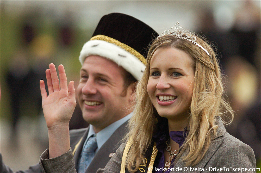
Light Painting – Dave’s R1
Sunday, August 16th, 2009Just two…


Just two…
Just for fun. HDR.

It always irks me to see more and more photographers finding the contrast slider in photoshop or their photo processor of choice. It’s clear when someone goes overboard with the contrast slider because everything looks super black and super white and all definition in light and dark grays are lost because of the high contrast. It’s one thing when you’re going for a look, but another if you’re just trying to take “good photos”. I’m a fan of photos coming straight off the camera. If you have to process your images a ton it pretty much shows that you can’t get it right in camera. Most of my photos aren’t processed, more than levels or small adjustments. This is one of the reasons why it’s important to not go overboard.


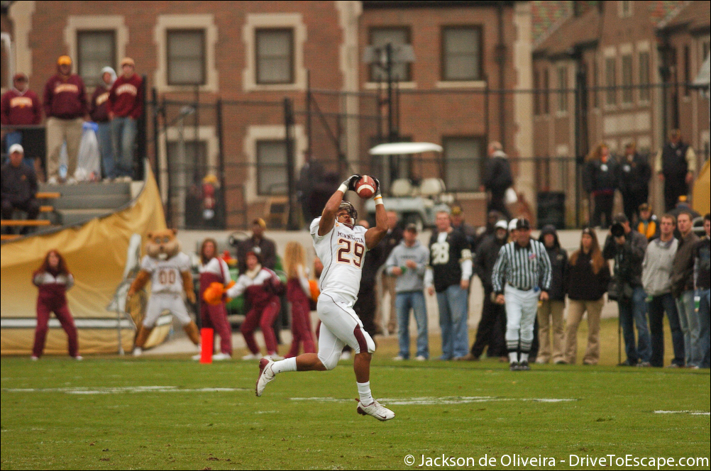
The first photo is straight off the camera. You can see that it is slightly washed out, but perfectly fine without any adjustments.
The second photo is super high contrast. Look at the jersey on the Minnesota player (white): the previous places where there were light grays are now almost pure white. You’re losing definition on whites and blacks. Not to mention the grass here now looks super un-realistic. Sure you lose the “haze” from the photo, but is it worth the cost? In my opinion, the photo looks too unrealistic and you’re losing even more dynamic range that digital doesn’t have to spare.
The third photo is only slightly more contrast than straight off the camera. Some haze is removed from the photo, colors get a bit more saturated and you don’t lose a lot of detail in the areas that can’t lose a lot of detail. The background that is out of focus isn’t as distracting as in the high contrast photo and in turn, there is more separation from the background and the subject.
Minnesota defensive tackle Garrett Brown unsuccessfully attempts to sack quarterback Justin Siller.
Shot at ISO 500, F/4.0, 300mm on 1.5x crop body(D1H I believe), @ 1/2000.
Interesting results, but nothing suprising. All shot at ISO 800, on D80. These are 100% unedited besides matching of color temperature. Shot RAW. No VR. No Filters.
1st: full frame | 2nd: 100% crop | 3rd: bokeh 100% crop


28mm 2.8 @ 2.8 (E-Series, manual focus)
For being wide open this lens is damn sharp. Not horrible bokeh, a bit “doughnutish,” but not nice enough when compared to some other lenses that have fantastic bokeh(85 1.4…). Stopped down this is wiiiicked sharp. If you don’t have focus, it really shows it. Fairly large DoF for 2.8 because of the focal length.


50mm 1.8 @ 1.8
Not as sharp as the 28mm, but still this is pretty good for the aperture. We can’t say it’s also because it’s cheaper, because it really isn’t. Only difference with this lens and the 28 is that this is over 1 stop faster, longer length and has AF. Bokeh is a bit ugly, almost like a crescent moon, which is annoying. I don’t mind it too much, but it might be a bad copy… who knows. I’m not worried about it.


50mm 1.8 @ 2.0
Almost the same as at 1.8. Only stopped down 1/3 of a stop here, but sharpness was improved a little and bokeh seems to be about the same, although ever so slightly less rounded, but more round. (more of an overall even circle, but more like a hexagon)


50 1.8 @ 2.8
Just proof how cheap lenses can look great stopped down. This is pretty sharp. Bokeh has changed a lot, obviously, but still looks pretty good. Check out the full frame and see what you think! Creamy bokeh that isn’t as destracting in my opinion as at f/1.8 or f/2.0.


18-55 3.5-5.6 @ 24mm, 4.0
wow. This is the kit lens at it’s maximum aperature for this focal length. If you can’t tell the difference here, look very close at the letters on the can. Crisp clean lines, that’s what’s important. Granted this was shot at f/4, a full stop off anything else. You might notice some barrel distortion here, but I don’t worry about that too much, it’s a zoom. There are reasons why this is still in my arsenal, because it’s sharp, cheap, VR, and zoom. If you don’t need a shallow depth of field or low light performance, no reason to not keep this lens as a spare, or in my case, if you can’t afford much else. 🙂
I think that’s about it. Feel free to email me if you have any questions. Jackson [at] drivetoescape.com
Just a few shots before sunset. I was kinda in a rush so they’re not awesome. 🙂

(I should mention these are unedited… I hate powerlines.)


Yep.
Just a few from Purdue.

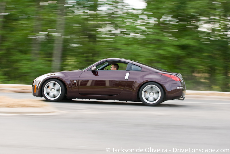
Again, the Civic.


One from the shoot. Enjoy it.

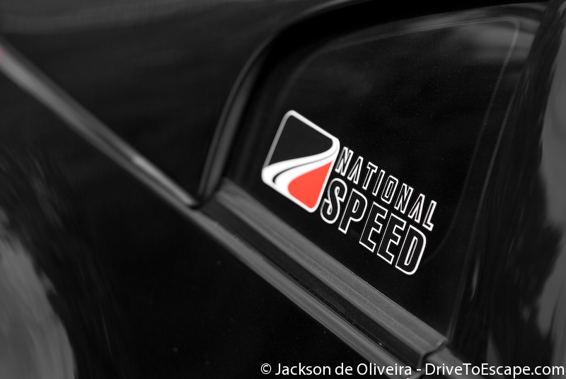
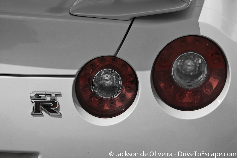
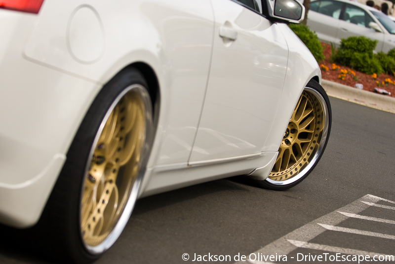
Few from the meet, got a lot done the last few weeks, but lots of photos taken.
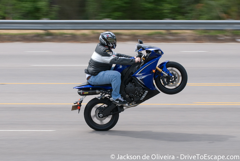
Enjoy the fast lens goodness.
DTE PhotoBlog is proudly powered by 220 volts and
WordPress.
Visualisation is taken care by Maryndor with his WPGlass theme.
Entries (RSS)
and Comments (RSS).